Hero banner
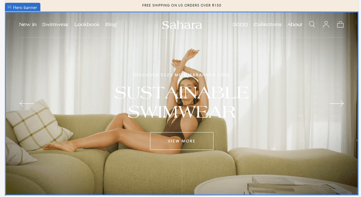
About:
The most valuable section on a storefront page is the hero section. Merchants frequently use a slideshow to highlight their most recent promotions and best-selling products to make the most of it.
Carousel:
Hero height: Between 50% and 100%
Note: Set the height of the hero to change the height of the slide. This setting is available only for desktop.
Enable autoplay: On / Off
Autoplay interval: Between 3 and 60 seconds
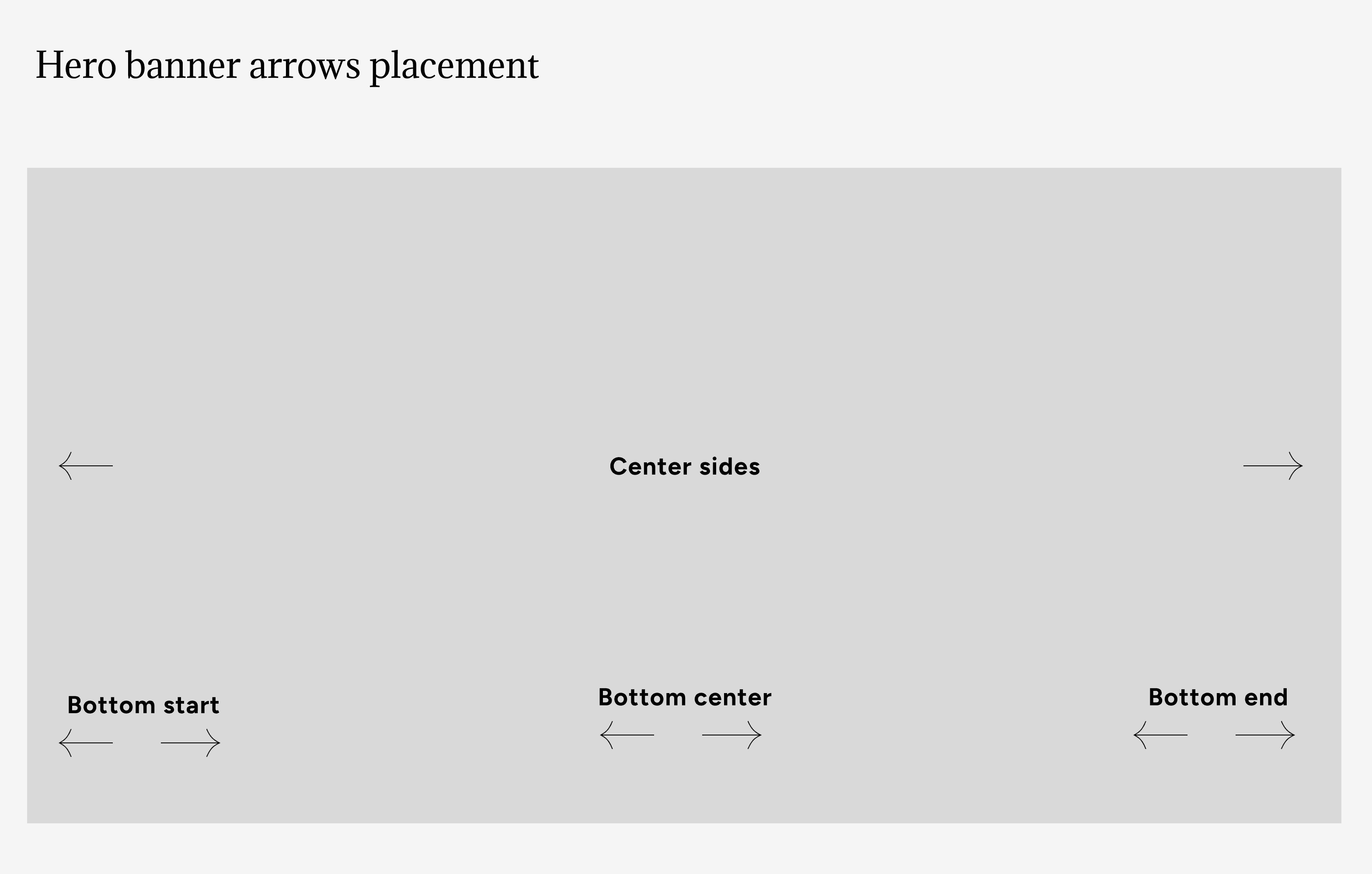
Carousel navigation arrows
Enable: On/Off
Note: They are visible only on desktop & tablet
Position: Center sides / Bottom start / Bottom center / Bottom end
Color: Default / Secondary / Inverse
Example:
Slide:
Note: To add a slide, please head to the customizer (left hand side of the screen), and click on "Add slide" under the "Hero banner".
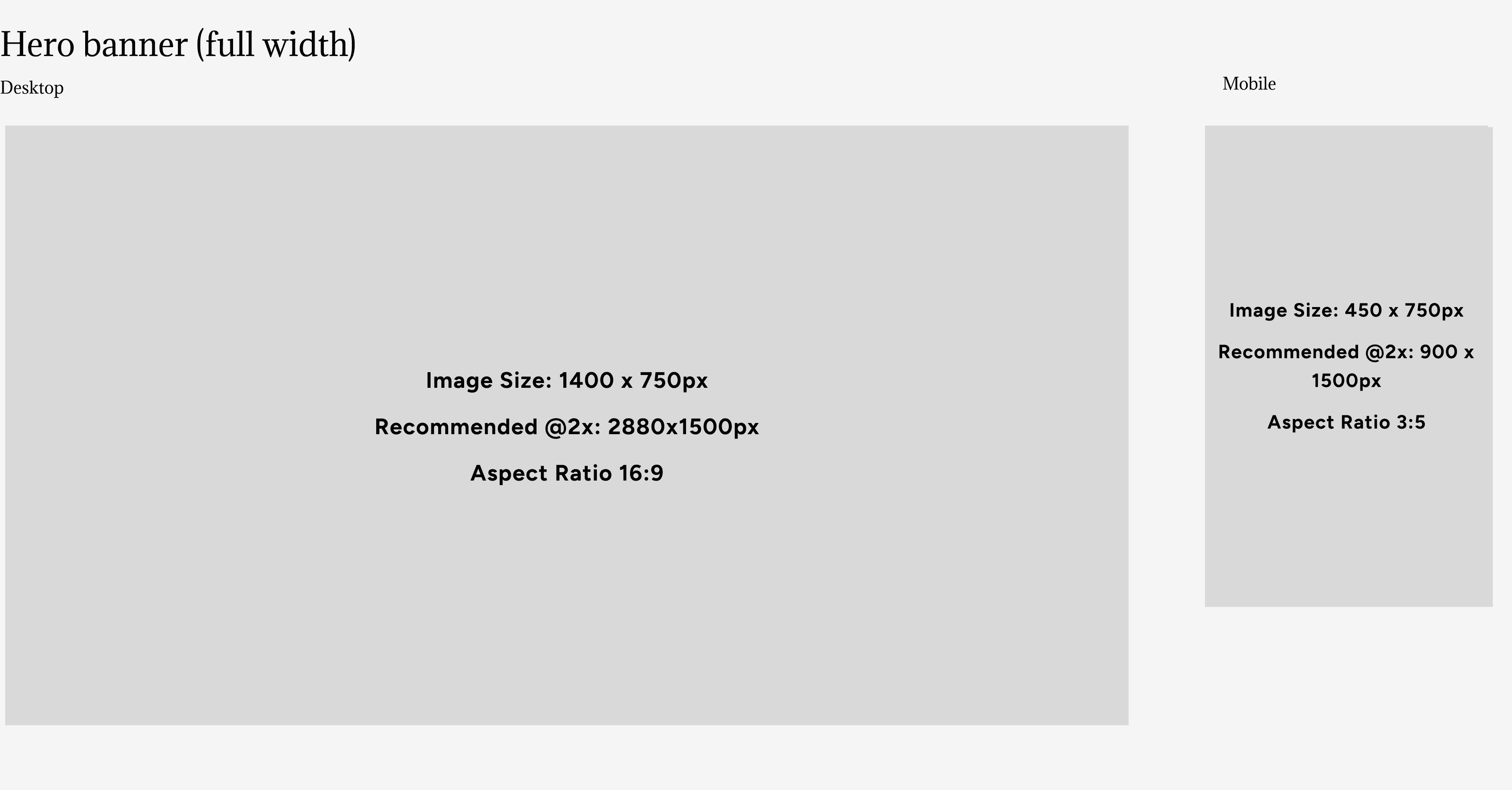
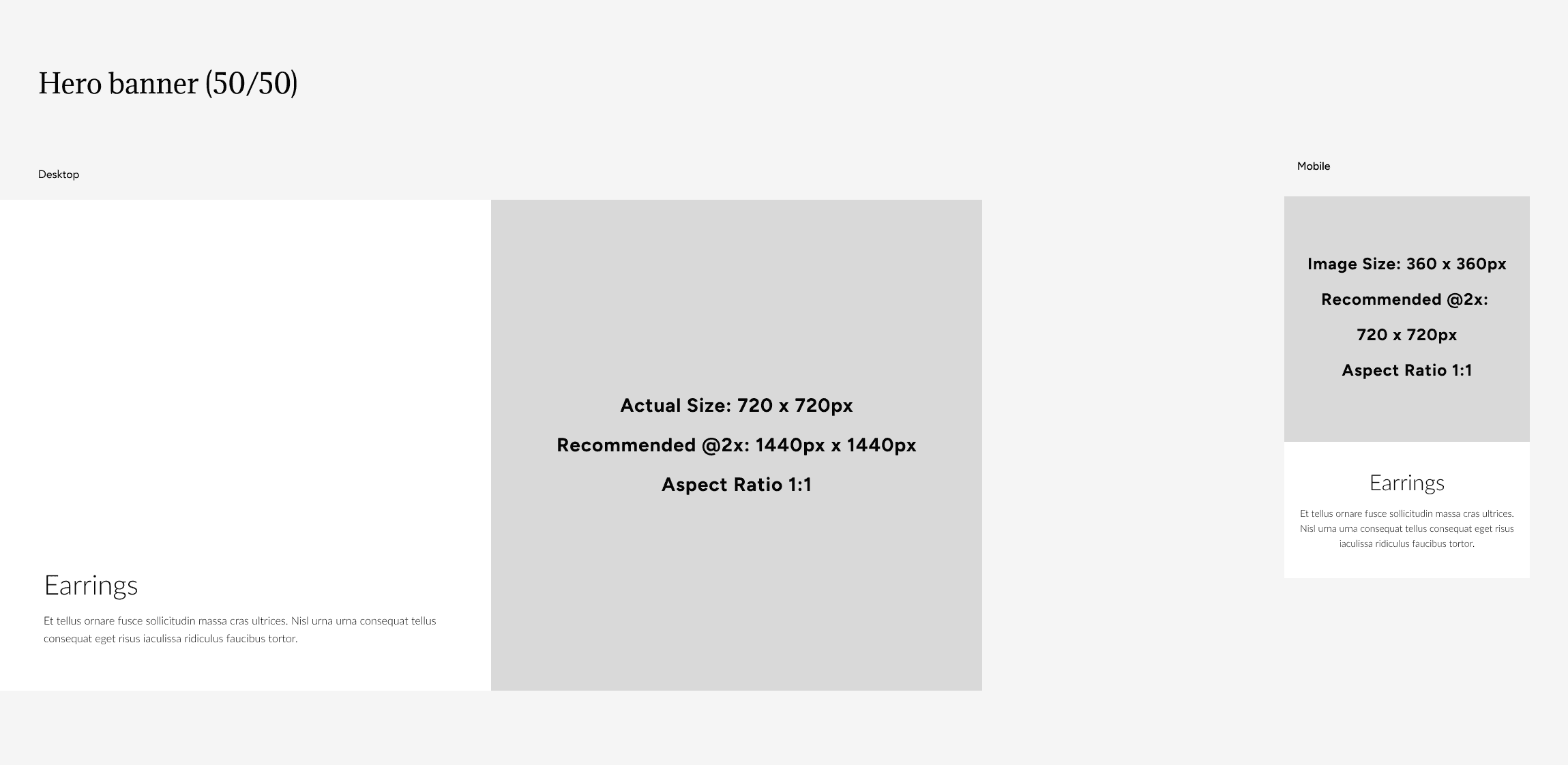
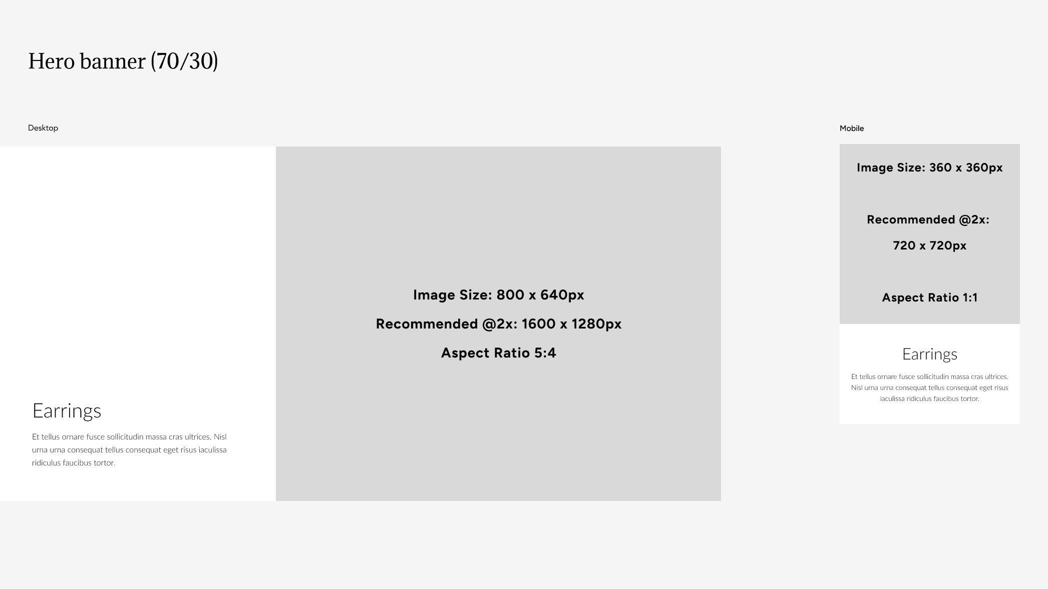
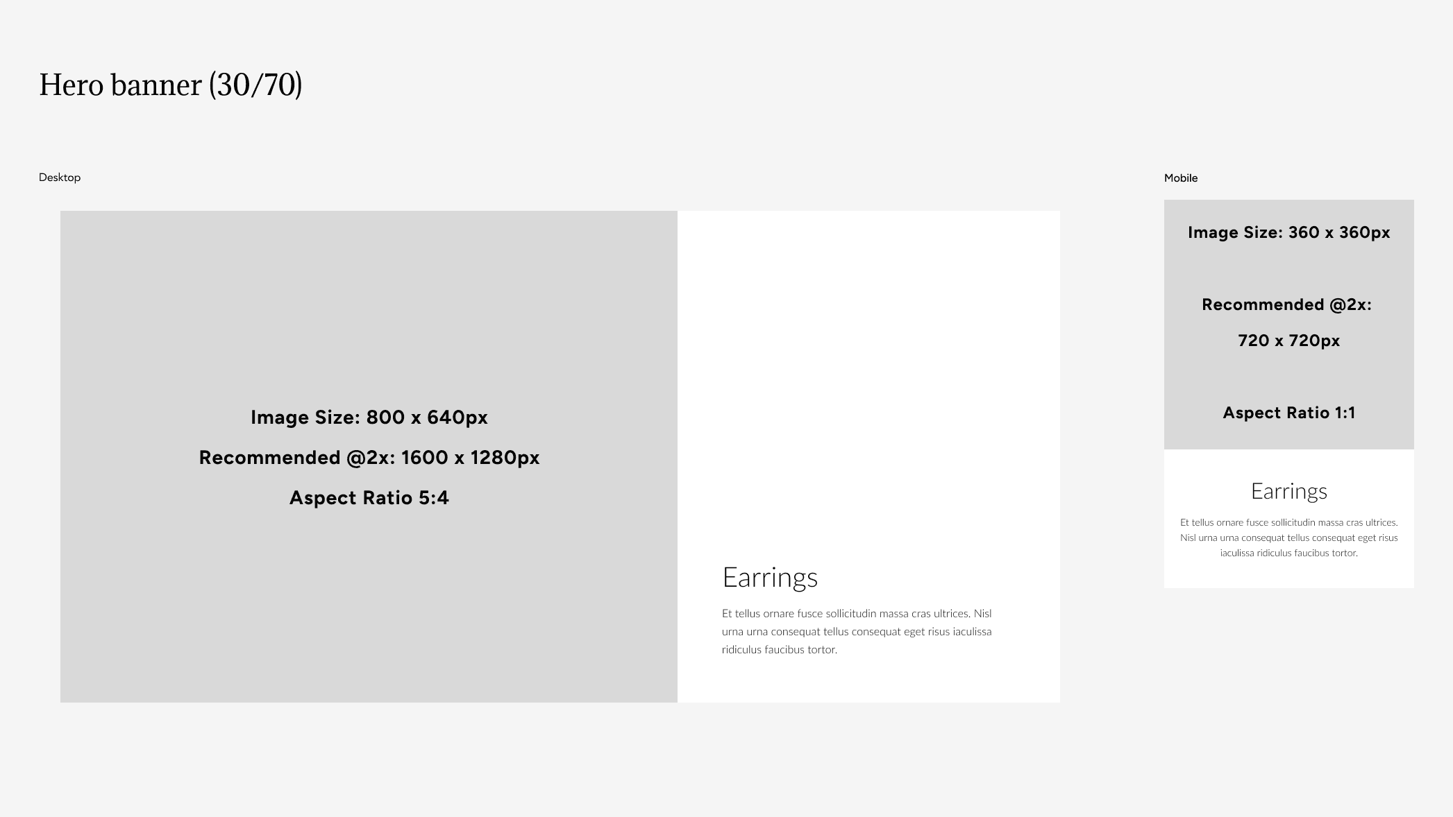
Banner layout: Full, 70/30, 30/70, Split.
Examples:
Full:
50/50:
70/30:
30/70:
Color scheme:
Text: Default / Secondary / Inverse
Backgrounds and borders: Default / Secondary / Accent 1 / Accent 2 / Inverse
Header menu color: Select the color of your navigation in each slide, to be in contrast with the slider's colors. This setting is available specifically when the transparent header is used.
Media desktop:
Image: Select from your library
Video: Select one from your library
External video: Paste a link
Note: External video overwrites both the image and video, while the Video from your library will only overwrite the image. Furthermore, we recommend you use the normal video where you use one from your store's library rather than a link for better performance. External videos can cause performance issues.
Enable overlay: On / Off
Media mobile:
Image: Select from your library
Video: Select one from your library
External video: Paste a link
Note: External video overwrites both the image and video, while the Video from your library will only overwrite the image. Furthermore, we recommend you use the normal video where you use one from your store's library rather than a link for better performance. External videos can cause performance issues.
Enable overlay: On / Off
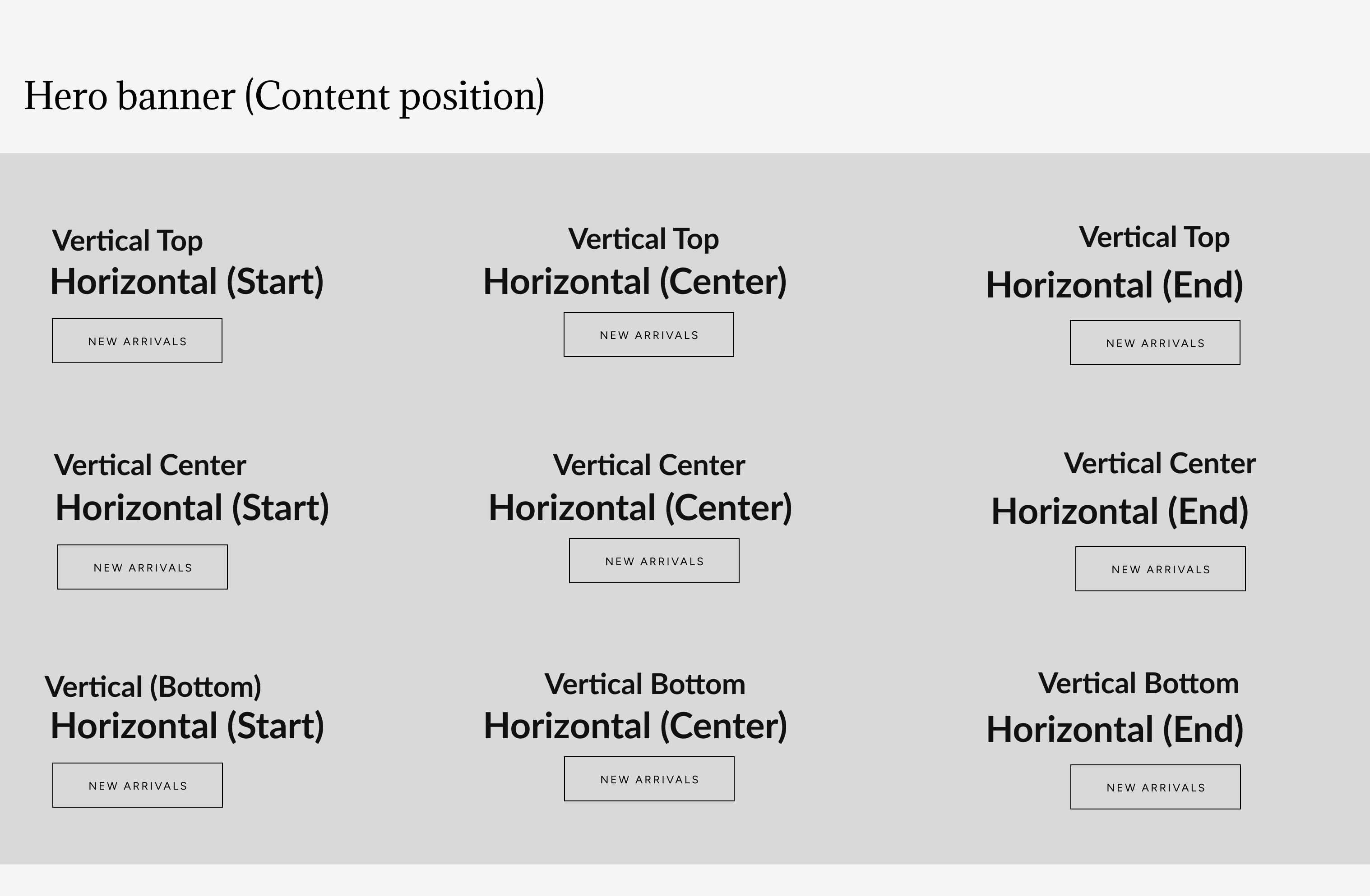
Content position:
This section is available for desktop and tablet only
Horizontal: Start / Center / End
Vertical: Top / Center / Bottom
Visual example:
Text:
Subheading: Text box for your subheading
Subheading URL: Enter one only if you want your subheading to be clickable with a redirect
Heading: Text box for your heading
Body text: Text box designed for descriptions
Enable vertical line: On / Off
Note: Displays a vertical line below button. Visible only when content is horizontally centered.
Button:
Button style: Filled / Outlined / Outlined inverse / Default

Note: Primary button style on theme settings is used when default is selected.
Label: Text box
URL: Enter a URL or select an existing page within the theme for this button's redirect.
Contact UsWas this article helpful?
Have more questions? Submit a request