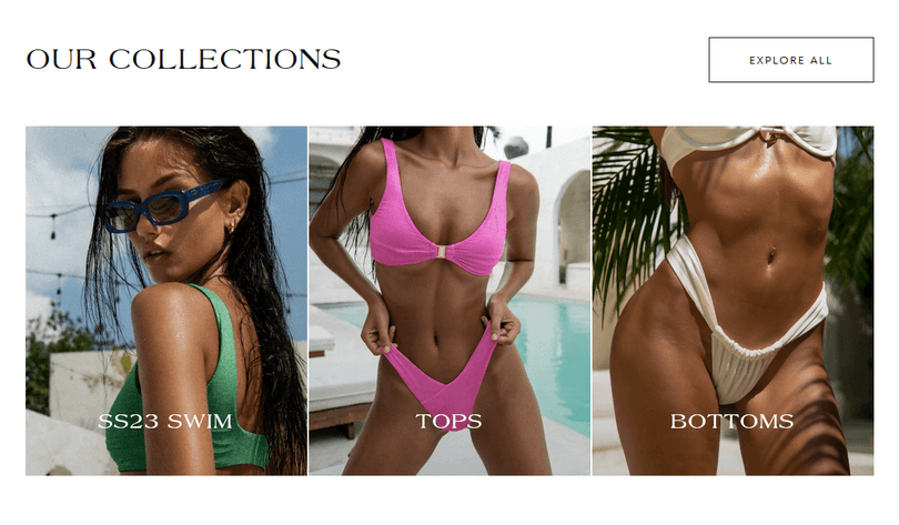
Featured collections

About:
The Featured collection section is designed to draw attention to a specific collection on your home page.
Settings:
These are the eneral settings that apply to the featured collections section.
Vertical spacing:
Desktop: Normal / Top none / Bottom none / Top and bottom none
Mobile: Normal / Top none / Bottom none / Top and bottom none
Layout:
Layout: Style 1 / Style 2
Note: The above styles are for the alignment of heading, button and arrows
Desktop gap: Between 2 and 64
Mobile gap: Between 2 and 64
Color scheme:
Text: Primary / Secondary / Inverse
Background and borders: Primary / Accent 1 / Accent 2 / Inverse
Text:
Heading: Enter a heading for this section.
Button:
Bytton style: Filled / Outlined / Outlined inverse / Default
Label: Enter a label foryour button
URL: Select the URL for the button (e.g. All collections).
Collection slide:
You can add a collection slide from the left hand side of the screen inside the customizer, by clicking on "Add collection slide" underneath the "Featured collections section"
Color scheme for the collection slide's text: Default / Secondary / Inverse
Collection: Select a collection to showcase
Image: Select an image representative to your collection.
Note: By selecting an image, you will overwrite the collection image
Heading: Enter a heading for the collection card
Contact UsWas this article helpful?
Have more questions? Submit a request