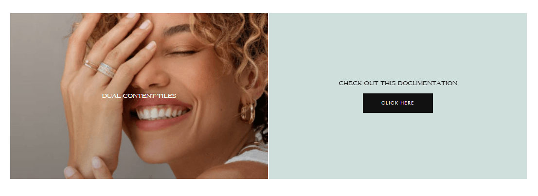
Dual content tiles

About
In this documentation, we'll cover the setup and customization options for the Dual Content Tiles section. This section allows you to showcase content in various layouts and styles, tailored to highlight different aspects of your products or services.
Settings:
You can find the general settings for this section below.
Dual content tiles:
Section width: Page width / Full width / Seminarrow width / Narrow width
Section height: Select the height between 25 and 100 vh
Note: The setting above only applies to desktop
Adapt to content: On / Off
Note: This setting will adapt the section according to the content if your content is larger than the section height
Layout: 50/50 , 70/30, 30/70
Gap between tiles: Select a gap between 0 and 6,4 rem
Mobile gap between tiles: Select a gap between 0 and 6,4 rem
Vertical spacing:
Desktop top spacing: Can be set between 0x and 6x
Desktop bottom spacing: Can be set between 0x and 6x
Mobile top spacing: Can be set between 0x and 6x
Mobile bottom spacing: Can be set between 0x and 6x
Tiles:
You can add a tile from the left hand side of the screen inside the customizer by clicking on "Add tile" button underneath "Dual content tiles".
Note: This section supports a total of 2 tiles
Color scheme:
Text: Primary / Secondary / Inverse
Background and borders: Primary / Secondary / Accent 1 / Accent 2 / Inverse
Media desktop:
Image: Select an image for the tile
Video: Select a video for the tile
Note: The setting above will overwrite the image
External video: Paste a link
Note: The setting above will overwrite both the uploaded video and image
Video aspect ratio: 16:9 / 4:3 / 3:2 / 1:1 / 2:3 / 3:4 / 9:16
SVG code for placeholder: Paste your SVG code here and it will be used as a placeholder image.
Media mobile:
Image: Select an image for the tile
Video: Select a video for the tile
Note: The setting above will overwrite the image
External video: Paste a link
Note: The setting above will overwrite both the uploaded video and image
Video aspect ratio: 16:9 / 4:3 / 3:2 / 1:1 / 2:3 / 3:4 / 9:16
Compact video: On / Off
Note: Video will be displayed in a compact format on mobile
Content position:
Horizontal: Start / Center / End
Vertical: Top / Center / Bottom
Text:
Heading: Enter a heading for this tile
Text size: Between 1x and 4x
Body text: Enter a text as body for this tile
Button:
Button style: Filled / Outlined / Outlined inverse / Text
Note: Primary button style on theme settings is used when default is selected.
Separator: On / Off
Note: Enable to add a vertical line between text and button when text is centered. Desktop only.
Button label: Enter a label for your button
URL: Enter an URL or select from the ones existing in your store.
Layout:
Content layout: Media on top / Media overlay
Spacings:
Note: This settings are for destkop only.
Block margin start: Between 0 and 16rem
Block margin end: Between 0 and 16rem
Block padding top: Between 0 and 16rem
Block padding bottom: Between 0 and 16rem
Block padding start: Between 0 and 16rem
Block padding end: Between 0 and 16rem
Contact UsWas this article helpful?
Have more questions? Submit a request