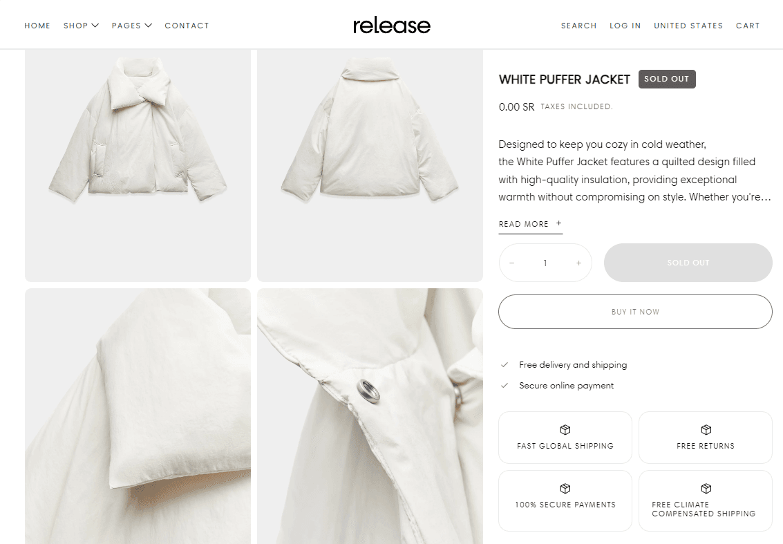
Product Page

About:
The Product page settings allow you to customize the display and functionality of media elements on your product pages. These settings give you control over the layout, appearance, and behavior of product images and videos, ensuring a cohesive and engaging user experience across all devices.
Product Media Settings:
Gallery Layout Grid / Slideshow / Carousel
Gallery Layout on Mobile Slideshow / Carousel
Gallery Thumbnails Determine where and how thumbnails are displayed.
- None
- Both
- Desktop
- Mobile
Note: On mobile, thumbnails are horizontal and below the main image.
Thumbnail Image Ratio: Portrait / Square / Landscape
Media Object Fit: Cover / Contain
Adaptive Ratio and Auto Height: None / Adaptive ratio / Auto height
Transparent Background: Enable or disable a transparent background for the media.
Disable Media Zoom: Toggle the ability to zoom in on media.
Navigation & Additional Settings
Gallery Arrows Show On Desktop / Mobile / Both
Display Media Gallery Pagination None / Over gallery / Under gallery / Mobile only
Show Media Indicator: On / Off
Media Gallery Info
Metafield for 'As Seen On' Enter the related metafield namespace and key to show images as 'As seen on', e.g., 'theme.as_seen_on'.
General Settings
Enable Actions Bar on Mobile: Enable or disable the actions bar on mobile devices.
Display Action in Double Row: Suggested for options with long characters.
Content Alignment Left / Center / Right
Color Scheme for Gallery To edit all your theme's colors, go to your color theme settings.
Color Scheme for Arrows To edit all your theme's colors, go to your color theme settings.
Product gallery position: Start / End
Space between gallery and content:: No / S / M / L / XL
Bottom spacing unit for the blocks: From 0 and up to 4rem
Elements:
Badges:
Badges Position Next to title / In a row
Title
The title will be pulled from the product's backend.
Price
Show Tax Information (Checkbox)
Show Shipping Information (Checkbox)
Show Custom Information (Text Box) Note: Overwrites other settings.
Description
Behaviour: Plain / Accordion / Tab
Note: You need to add content tabs block to set tab.
Heading: Text Box
This heading overwrites the default heading of the block.
Truncate Line Limit: Numeric Value
Note: You can disable by setting 0.
Icon Note: Leave blank to hide the icon. You can find the list of available icons here.
Custom Icon Note: This will overwrite the default icon.
Variant Picker
This field's purpose is to display the correct name across section blocks._
Variants Display Dropdowns / Buttons
Show Variant Image for Swatches Note: This option works with the button display type. If variant image is not available, it shows the default buttons.
Dropdown Layout Rows / Columns
Size Guide (can be linked) Displays the content of the page that needs to be created specifically for the size guide popup.
Size Option Label Text Box
This option is needed to identify where to display the size guide popup button. You can simply write your size variant option name. Example: Size
Purchase Options
Buy Buttons
Show Quantity (optional)
Quantity Type Inline / Separate
Show Dynamic Checkout Buttons Note: Using the payment methods available on your store, customers see their preferred option, like PayPal or Apple Pay
Show Recipient Information Form for Gift Cards Note: Allows buyers to send gift cards on a scheduled date along with a personal message.
Inventory Notice
Inventory Threshold: Numeric Value
Don't Show the Quantity, Show Only the Text Checkbox
Content Grid
Heading: Text Box
Icon Leave blank to hide the icon. You can find the list of available icons here.
Custom Icon: Optional custom icon to display.
Contact UsWas this article helpful?
Have more questions? Submit a request