Collection template & Text Card
About:
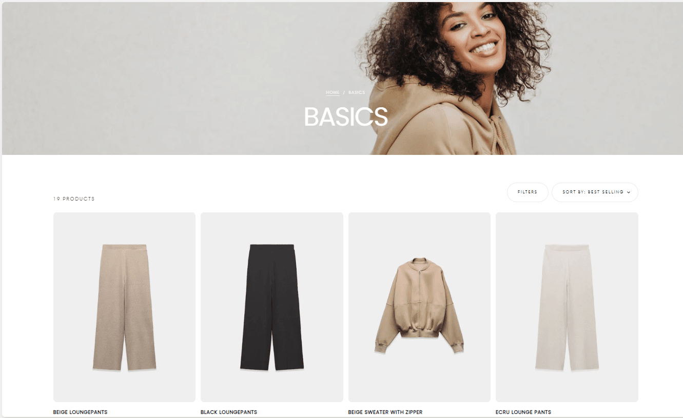
The collection template is where you can choose the styling of how the products in your collections are displayed.

General Settings:
Enable Products Count: Enable this option to display the total number of products in the collection. This helps customers understand the scope of available products.
Enable Sorting: Enable sorting to allow customers to arrange products based on criteria such as price, name, etc.
Filter: Hide / Drawer / Sidebar
Enable Opened Accordions: Enable this option to have filters initially expanded (opened) in the accordion layout for easier access.
Filters:
Options: Hide / Drawer / Sidebar
Product Grid
Products per Row This is for desktop, and has two available choices, three or four
Products per Row for Mobile Has two available choices, one product, or two
Products per Page: Note: The number of products will automatically adjust based on the text card size to maintain layout consistency
Pagination Style:
Page Numbers / Load More
Text Card - Example:

About:
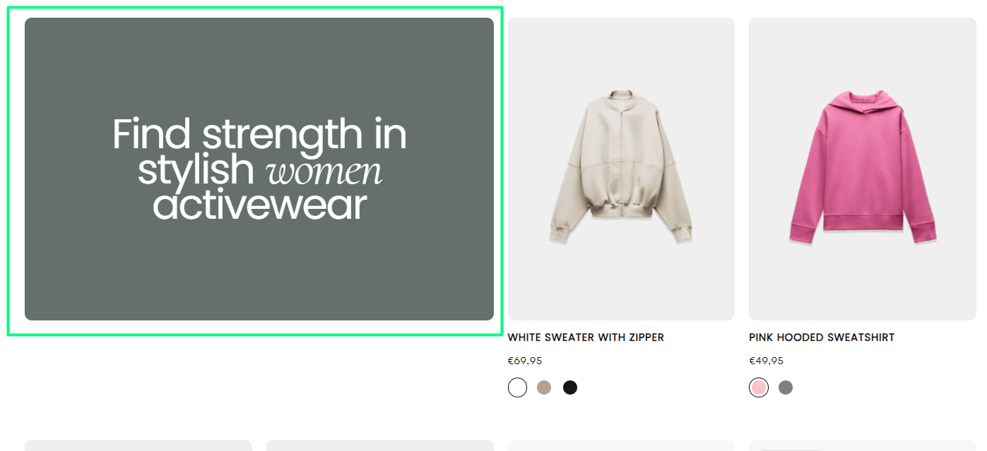
A text card, is a break in the collection where you can add stylish images or promotional information to augument your customers' experience inside your collections. You can add information about the collection, or a discount code in it, and this gives you a better indirect interaction with your customers.
How to:
The text card can be added directly beneath the collection, from the "Add text card block". You can add up to five (5) text cards, where you can either add an image, a heading, or both, along with a button and redirect URL to a page of your choosing.
The text and image can also be dynamically connected, therefore, you can control what each collection will display.
Text card options:
Color scheme: Choose the desired color scheme
Text: Your advertisment goes here
Link: Redirect your customers to a particular page
Link type: Button / Card
Button label: Leave empty if you don't want to use a button
Button style: Filled / Outlined / Text
Content position: Top / Center / Bottom
Content alignment: Start / Center / End
Content position for mobile: Top / Center / Bottom
Content alignment for mobile: Start / Center / End
General settings for the card:
Position: 1 -- 28
Note: If position number is higher than products per page number, products per page number will be used
Column factor: 1 -- 4
Row factor: 1 -- 4
Image: Choose a background image for your text card
Contact UsWas this article helpful?
Have more questions? Submit a request