Hero Banner
About
In this documentation, we'll be discussing about the general settings as well as the slider settings for the Hero banner section in a Shopify store. This section allows you to showcase prominent content at the top of your webpage, such as promotional messages, featured products, or important announcements. It supports images, videos, and customizable text to create an engaging first impression for your visitors.
Slideshow settings
Hero height: Set the height of the hero to change the height of the slide. Only desktop.
Slideshow autoplay interval: Specify the interval in seconds for the slideshow to switch slides. If set to 0, autoplay will be disabled.
Show slideshow navigation: Enable this option to display navigation arrows for the slideshow on desktop.
Slideshow navigation position: Sides / Left / Center
Color scheme for arrows: To edit all your theme's colors, go to your color theme settings.
Important note: To change the colors of the hero banner's arrows, you'll have to change the color of the "Filled button" inside your chosen color scheme
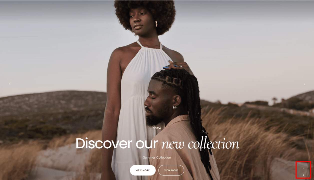
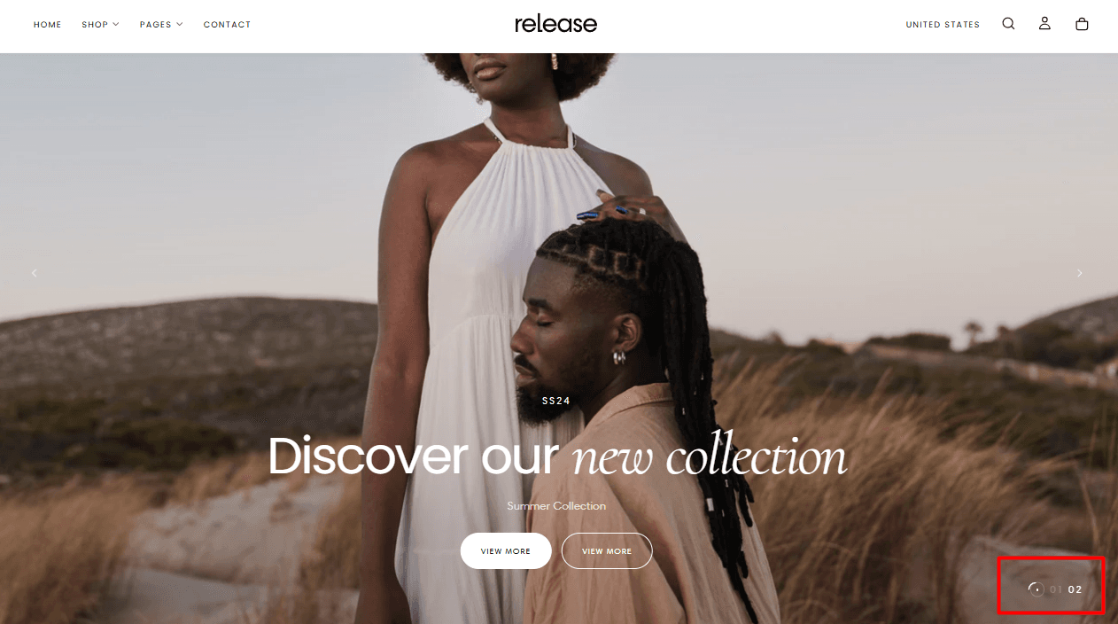
Show slideshow pagination: Enable this option to display pagination for the slideshow on both desktop and mobile.
Slideshow pagination style:
Style 1 example:
Style 2 example:
Floating Bar Activate this option to enable a floating bar when the marquee section is added right after the hero section.
Slider settings
Note: You can add slides from the left hand side of the screen in the customizer:

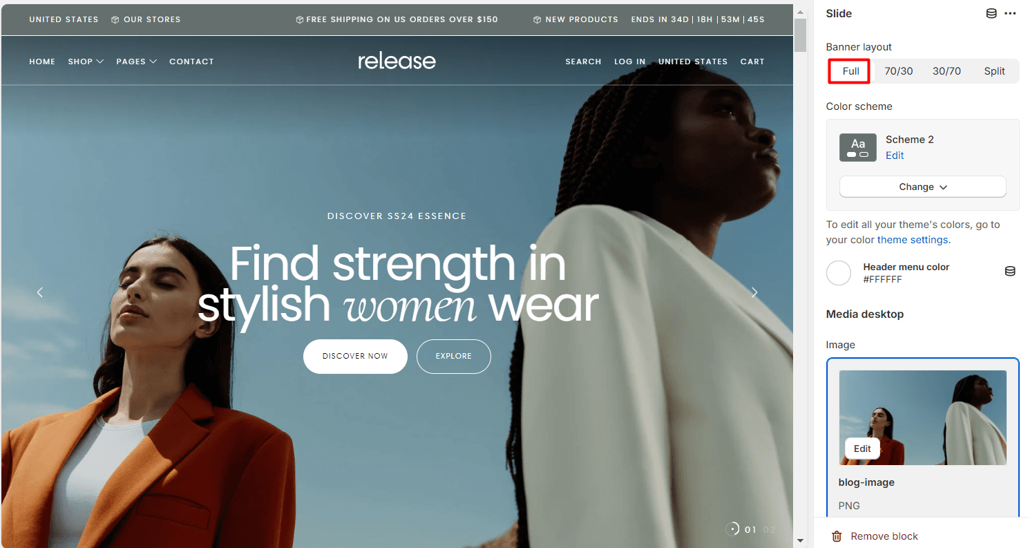
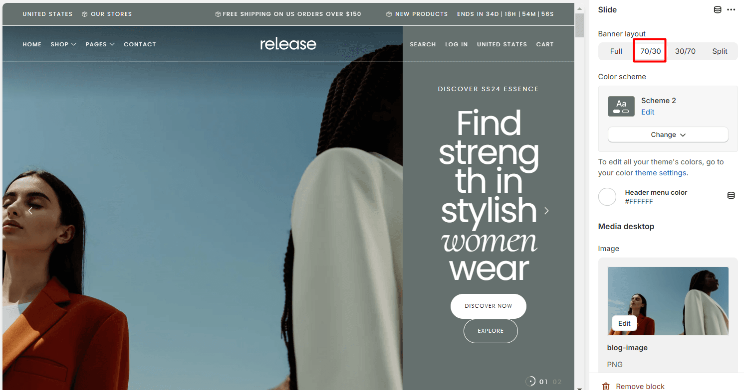
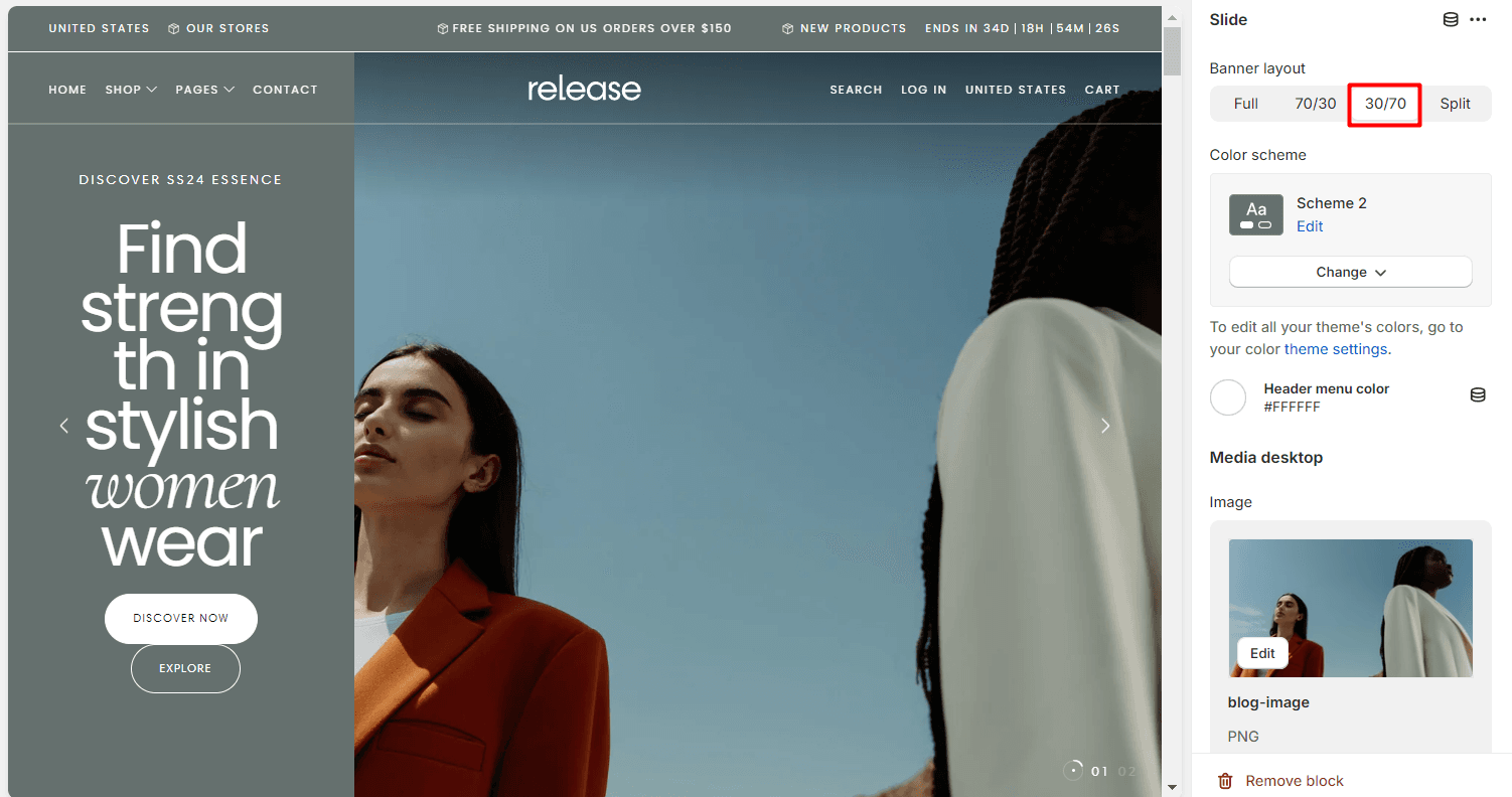
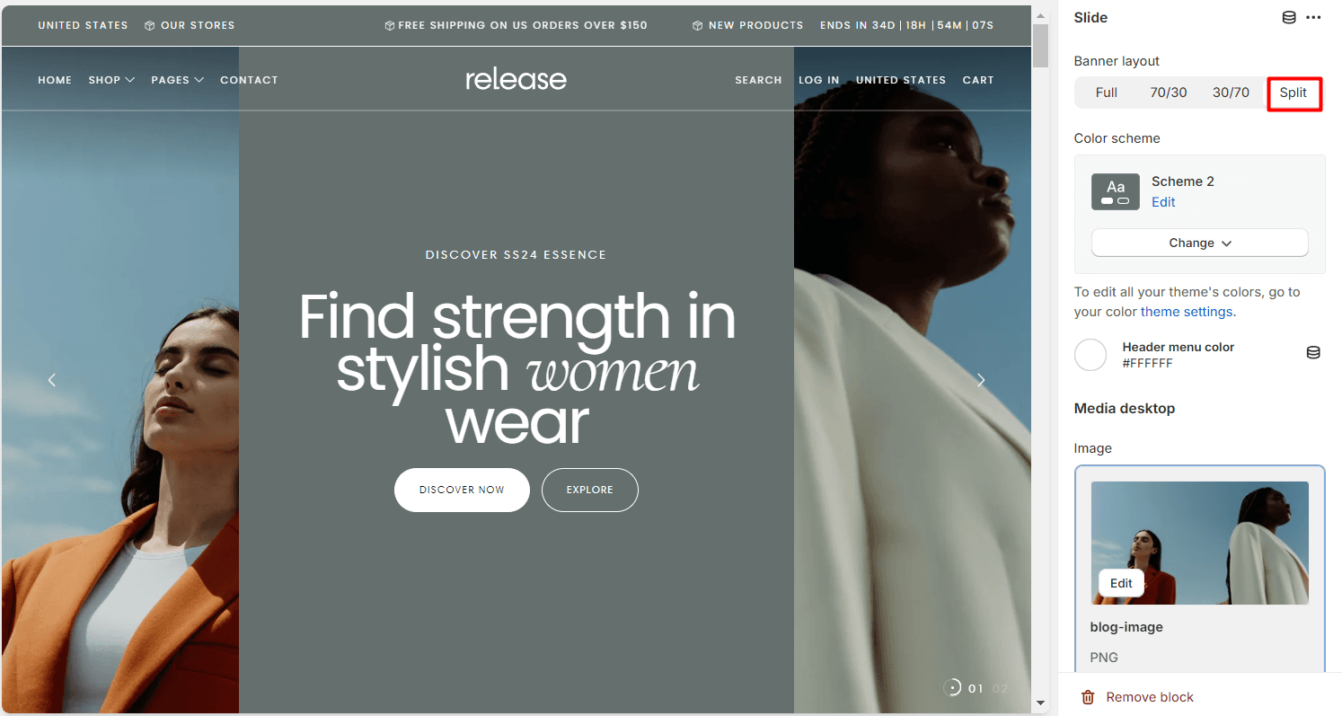
Banner layout: Full / 70/30 / 30/70 / Split
Example Full:
Example 70/30:
Example 30/70:
Example Split:
Header menu color Set the color for the header menu.
Media desktop
Image Upload or select an image for the desktop version of the hero banner.
Video Select a video to be used as the background, overwriting the image.
External video Paste a link to an external video. This will overwrite the image and video options. External videos may cause performance issues, so it is recommended to use the video option for better performance
Show video controls Enable this option to display video controls.
Enable overlay Enable an overlay effect on the media.
Media mobile
Note If mobile media is set, it will be used on mobile devices instead of the main media.
Image Upload or select an image for the mobile version of the hero banner.
Video Select a video to be used as the background, overwriting the image.
External video Paste a link to an external video. This will overwrite the image and video options. External videos may cause performance issues, so it is recommended to use the video option for better performance.
Show video controls on mobile Enable this option to display video controls on mobile.
Enable overlay Enable an overlay effect on the media.
Content
Content alignment: Left / Center / Right Desktop and tablet only.
Content position: Start / Center / End Desktop and tablet only.
Heading Specify the heading text for the slide.
Subheading Specify the subheading text for the slide.
Subheading link (Paste or select a link or search to link the subheading to a page or product.)
Text Add additional text content for the slide.
Buttons:
First button type Button / Card
Note: Card type will make the entire slider clickable with redirect, instead of having to use the button.
First button link Paste a link or search to link the first button to a page or product.
First button style Filled / Outlined / Text Primary button style on theme settings is used when default is selected.
Second button label Specify the label for the second button. Leave empty to hide the button.
Second button link Paste a link or search to link the second button to a page or product.
Second button style Filled / Outlined / Text Primary button style on theme settings is used when default is selected.
Contact UsWas this article helpful?
Have more questions? Submit a request