Featured collections

About
The Featured Collections section enables you to showcase your curated collections in a visually appealing layout, allowing visitors to explore and discover your products effortlessly.
General Settings
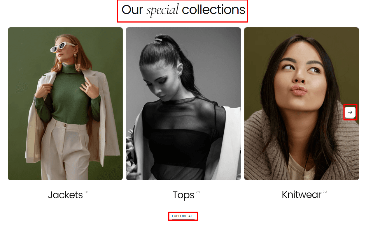
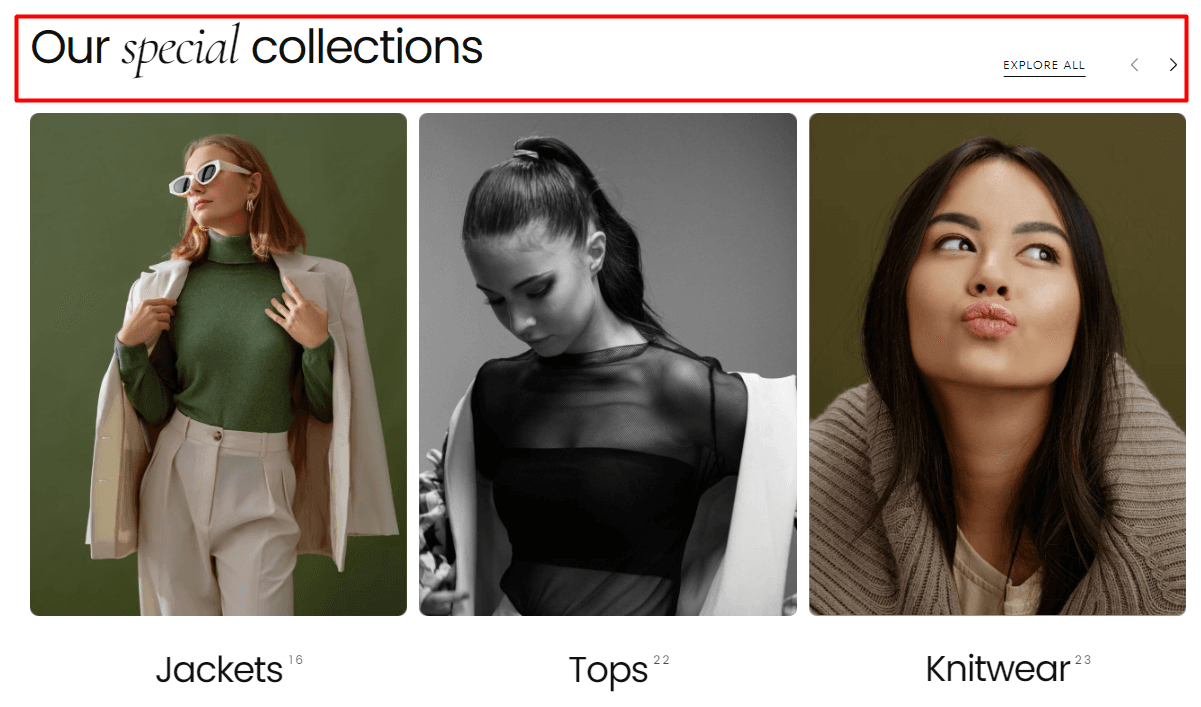
Choose between two layout options to display your featured collections::
Layout 1

Layout 2

Heading: Enter a title to introduce your featured collections, e.g., "Our Collections."
Subheading: Add a brief description to encourage visitors to explore further, e.g., "Explore our collections."
Button Label: Optionally, add a button label to prompt users to explore all collections, e.g., "Explore All." Leave empty to hide the button.
Button Link: Provide the URL link to the page containing all collections. For example, you can link it to the "All Collections" page.
Button Style: Filled, Outlined, Text
Note: The featured collections section can be added below the collection page's page banner as a "Card collage":

Collection card
Card Layout: Collection / Product / Text
Card Style: Normal / Compact
Image aspect ratio: Auto / 1:1 / 3:4 / 4:5
Content Alignment: Start / Center
Collection title style: Single text / Text with arrow icon
Collection product count: Hide / Show / Show with border
Slideshow:
Slides per view: between 1 and 12
Slides per view for mobile: between 1 and 4
Show carousel arrows: On / Off
Slideshow center alignment: On / Off
Enable slideshow overflow: On / Off
Collection Slide
How to: The featured collections can be added by clicking on the "Add collection slide" button from beneath the "Featured collection."
Collection Slide Customization Options
Link a collection: Choose between your collections
Image: If none is assigned, the image is pulled from the backend of the Shopify admin / if assigned, it will overwrite the collection image from the backend.
Heading: Add a heading for your collection or connect dynamic source to get the collection title automatically
Heading Sizes
XS: Extra Small heading size. S: Small heading size. M: Medium heading size. L: Large heading size.
Subheading: Text box that can be used to personalize a subheading
Contact UsWas this article helpful?
Have more questions? Submit a request