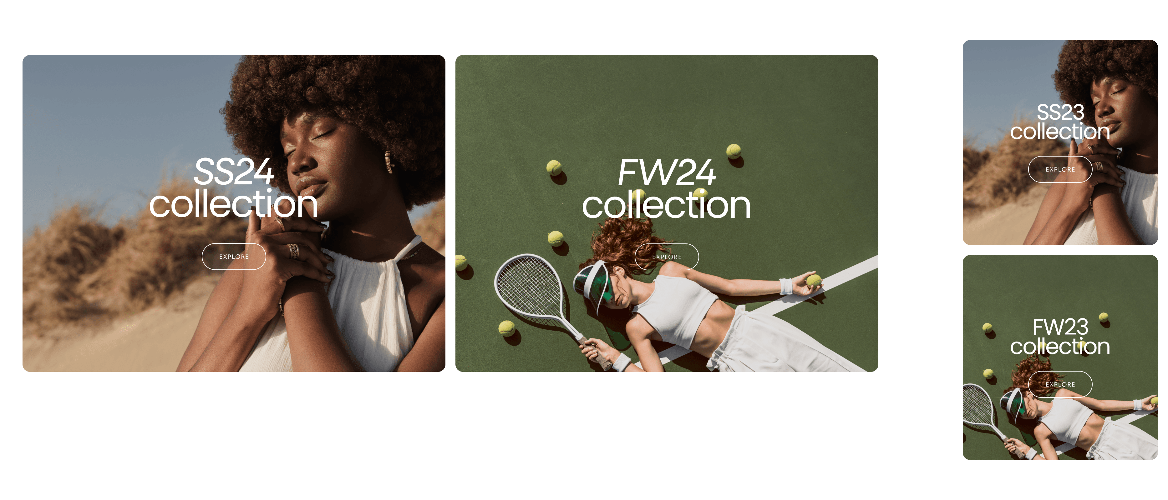
Dual content tiles

About
In this documentation, we'll cover the setup and customization options for the Dual Content Tiles section. This section allows you to showcase content in various layouts and styles, tailored to highlight different aspects of your products or services.
Section Layout
Separated / Stacked
First Block Size: Full / Half / Large / Small (Second one will be set automatically.)
Swap Order for Mobile Checkbox
Tile:
Show on: Desktop / Mobile / Both
Color Scheme: (To edit all your theme's colors, go to your color theme settings.)
Custom Background Color: No color chosen
Heading
Size: XS / S / M / L / XL
Text Select what text to be shown here.
Button
Label: Explore (Leave empty to hide the button)
Link: Example: New Collection
Style: Filled / Outlined / Text
Product
Select Product:
Aspect Ratio: 2:1 (Useful for images and videos. Auto option is recommended for long text.)
Vertical Position: Stretch / Start / Center / End
Content Position: Start / Center / End
Alignment: Left / Center / Right
Position: Before / Between / After
Media
Image Select an image
Video: Select video (overwrites image)
External Video: Paste a link (overwrites image and video. We recommend using the video option for better performance as external videos may cause issues.)
Show Video Controls: Mobile (If set, will be used on mobile devices instead of the main media.)
Mobile Media
Video: Select video (overwrites image)
External Video: Paste a link (overwrites image and video. We recommend using the video option for better performance as external videos may cause issues.)
Show Video Controls
This format maintains clarity and avoids redundant titles, focusing on essential information for configuring the Dual Content Tiles section. Let me know if there are any further adjustments needed!
Contact UsWas this article helpful?
Have more questions? Submit a request